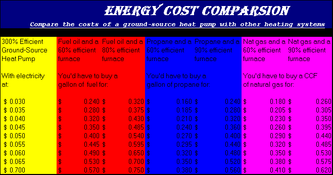
This is a cost comparison chart that compares energy prices. The left column consists of a 300% efficient ground-source heat pump. And it shows what you would have to buy the other fuels at to compare.